Sustainer
Zero waste to go meals
#User Experience
#Service Design
#Product Design
Featured in:
Core77
Reset.org
Mocoloco
Inhabitat
Current Design Journal
In collaboration with:
Kieran Wallace
@ Emily Carr University
Problem
The inspiration for this project came from the excessive amount of disposable food containers being thrown out each day. The problem space then became 'what is preventing people from bringing their own reusable container with them when they get meals to go?'.
Opportunity
How can a product service system eliminate waste created by disposable food containers? Why can’t a food container be a part of the every-day things we carry like keys, a water bottle or our phones?
Process book download
Solution
Sustainer is a reminder-based mobile app paired with a re-usable food container aimed to help reduce waste caused by disposable to-go food containers. The app and container are designed together as a cohesive system that addresses the main barriers to people bringing a reusable container with them when getting food to go which are forgetting the container, leakage, and carrying space.
The physicality of the container addresses the second and third barriers of leakage and awkwardness. The container is made of food-grade silicon and features a fold-top design creating a perfect hermetic seal; influenced heavily by roll top kayak bags. The Silicon allows for extreme flexibility making transportation and washing extremely easy.


The Mobile App


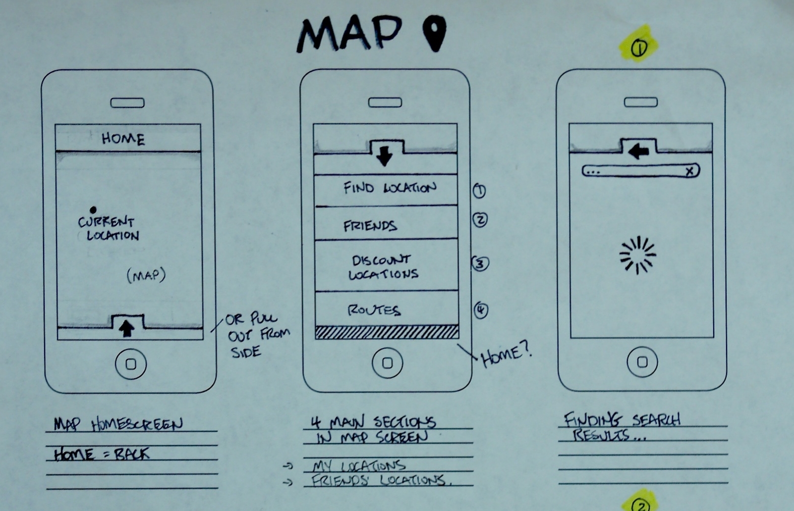
The app works by prompting the user when a person enters a particular restaurant. They then interact with the app by choosing one of three options and swiping down. Those options are: If they have brought their Sustainer, if they have decided to eat in, or if they forgot their Sustainer in which case they can be reminded to pack it when they arrive either at home or work. This is a pleasing interaction in which the user not only keeps track of their sustainability but also has the option to announce their progress through Facebook and Twitter. The app also includes a map element as well as a profile page where the user can view all their statistics pertaining to their container usage.
As an interdisciplinary design team we wanted to push the relationship the digital app had with the container as far as possible. We challenge the notion of literal smart technology, and develop the link through a visual and tactile relationship instead. The approach made the physical features and movements of the container be directly mirrored in the interactions of the app. This way the app and container became linked via their use and experience, not through an embedded chip.
so that the app would recognize when they entered the restaurant and send a prompt. Many precedent mobile applications were studied including Nike Plus, The Jawbone Up, Fitbit, and several others. These ‘meta products’ helped to inform the interaction the user would have with Sustainer.
One of the exciting features that enables the Sustainer app to work in this area of intervention is a technology often referred to as ‘geofencing.’ Geofencing uses GPS (Global Positioning Systems) and other location based technologies to set up a digital boundary around a physical location. In the context of the Sustainer app, the user would geofence frequented restaurants
Research
The research comprised of primary and secondary research, video sketching, user journeys, and a micro-scale collection and drop-off service system of mugs situated within our University campus.
Service safari - Disposable container
Observations
-An informed and enthusiastic clerk is very helpful towards guiding customers to behaviour change
-The option to bring your own container isn’t acknowledged in any way, no
touch point to even think about it
-What would a ‘bring your own container’ touch point look like?
-Convenience is key, plastic disposable is there, readily available
Insight
-Relationships are key, if the scale is small enough, and the clerk is knowledgeable, a sustainable community will easily be formed
Barriers to bringing a re-usable container yourself
Daily Behaviour
Forgetting the container is the first issue. The research question asked: can a food container become part of the everyday things we carry like keys, a water bottle, or our phones?
Security
A second barrier is the issue of leakage. A trust issue exists with current containers and their ability to create a perfect, hermetic seal. It is generally understood that we all carry things in our bags that are far too valuable such as a smartphone or tablet to risk a tomato soup spill.
Real Estate
The third issue with reusable food containers is their difficulty in transportation. Many of the current container designs do not accommodate a majority of different bag forms.
Video Sketching
Video sketching is a simple and quick method of rapid prototyping displaying accurate context along with different scenarios of how a user might interact with a product and/ or system. Communicating a rich interaction between a user, a product, and a smartphone proved to be more difficult than anticipated. Maps, diagrams and other two dimensional communication methods were deployed to try and communicate to instructors, friends and the public how the Sustainer system worked. After getting feedback it was realized that these methods were not getting the ideas across effectively.
Video sketching then became the most obvious way to better understand the interactions users would have with the product. This form of rapid prototyping and visualization was fundamental to getting a handle on what elements of the system had holes and which elements seemed flushed out. Video sketching was helpful in showing the context along with how the user would ideally interact with the product and system. It was also extremely versatile as it could easily be shown on a computer, tablet or even phone for quick feedback.
Mapping out nodes
First step in understanding the systems involved with our problem space. This infinity map is looking at all the possible touch points for a behavioural intervention.
Video sketching gave good insights to different scenarios. This exercise mapped out all the different points so we could compare and contrast the pros and cons of each point.
Final touchpoint selection
Home
This is where we keep all of our belongings and where we spend the most time. We looked at ways of getting a reminder to take your container when you are leaving the house. We noticed that when in a transition time, like leaving the house, we are less susceptible to reminders and less likely to stop and follow through.
Workplace
The issue here is that the chances of us not having our container at work is much higher. This poses a problem when structuring the entire system around reminders.
The Restaurant
We chose to focus on the restaurant as our primary location for the apps intervention. We have made the observation that when going to a restaurant, we are in a time of making choices. We choose what restaurant to go to and pick what food we want to eat. Can we choose to make our to-go meal less wasteful? We want to utilize this awareness to come in and offer another option.
Container Prototyping
Initial 3D sketches
Experiments with hinging and folds
The final two part mold
Casting attempts
App Protoyping
Initial sketches & features
Wireframes
Higher fidelity wireframes
Usability Testing
The user testing was done in two parts. One with the app, guided through directions. The second part had the user interact with the container, opening and closing it.


Purpose
The purpose of this study is to help inform our project in developing a re-usable container and reminder based behaviour mobile app to reduce waste caused by disposable food containers.
Scenario
The object in front of you is a prototype for a portable re-usable food container. We want to know how you think it works. We are going to ask you to do a few task with it.
Instructions
Closing
1 - Fold/roll the top of the bag. Is there one direction that is more intuitive than the other?
2 - How many folds does it take to feel secure?
Latch
3 - Once you have rolled the container closed, how would you secure it?
4 - Lock and unlock the latch mechanism.
Opening
5 - Now open the container.
Eating
6 - This container is meant to be eaten out of. How would you make it more accessible to eat out of?


Purpose
The purpose of this study is to help inform our project in developing a re-usable container and reminder based behaviour mobile app to reduce waste caused by disposable food containers.
ScenarioThis is a location based reminder app for mobile devices. You have just entered a restaurant that you frequent.
Instructions
The first screen you see is central to the app and your first touch point upon entering a restaurant.
1 - How would you tell the app that you have remembered to bring your ‘sustainer’?
(back to home page)
2 - How would you tell the app that you are using a disposable container?(back to home page)
3 - How would you tell the app that you are eating in at the restaurant?
(back to home page)
There are other features to the app.
4 - Get to the map feature where you can add your favourite local restaurants.
4a - add a ‘the noodle box’ to the map
4b - find a local restaurant that gives deals with sustainer
4c - find yourself on the map
5 - Now check out your stats
5a - find the settings button on the stats page and go to them
6 - Navigate back to the home page


